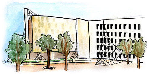
The Perry-Castaneda Library is met with more widespread contempt than any other building on UT’s campus.
James Holliday, an architecture senior, recognizes the PCL’s problematic reputation, but said the building isn’t to blame.
“We can say that the general consensus among UT students is that it’s a bad building, right?” Holliday said. “I think people don’t like it, frankly, because they’re using it the wrong way — I don’t think it’s meant for people to stay in for long periods of time.”
Open since 1977, the PCL is designed around the twentieth century student, who would need books and other primary resources for studying and research. To accommodate this need, the PCL was the first “open stack” library at UT, allowing students to find books for themselves for the first time in UT’s history.
The open-stack design provided opportunities for students to linger on interesting titles and bindings while searching for books. Located in the central core of each floor, the extensive bookshelves relegated study spaces near the outer walls. The long path students would now have to take from the elevator to get to the study spaces was designed to facilitate detours into new subjects.
“In each floor, the elevators and stairs put you into the very center with all of the books. I just don’t think we know how to use it correctly,” Holliday said. “For (modern students), studying doesn’t mean nearly as much research and going and finding text sources … we don’t need the physical experience of wandering, we can do virtual wandering and get the job done.”
That leaves the current student body with a main library inspired by pre-digital constraints. Walking through the PCL at night, you’ll find the many bookshelves on each floor unoccupied, while the study areas filled to capacity without any open outlets in sight.
In addition to a lack of modern necessities, the PCL’s jagged — and vaguely Texas-shaped — layout can be disorienting. The Campus Guide of the University of Texas at Austin admits the PCL “has never been a popular building on campus,” partly due to its “harsh and often confusing interiors.”
While discombobulating, the placement of the study spaces was actually a response to the PCL’s solar-sensitive layout. According to the Campus Guide, one of the most impressive aspects of the PCL is its climate responsive design, protecting the building’s occupants from the hot summer Texas sun.
“Deep vertical fins block the low east and west sun from entering the building and horizontal sunshades on the south face protect it from midday sun during the hotter portions of the year,” the guide says.
Holliday said in addition to benefits from energy conservation, the PCL’s design also creates optimal lighting conditions for the study spaces inside.
“When you’re inside standing at the windows, the light is really nice because it’s never direct … so it’s pretty well distributed when you’re inside or immediately adjacent to the windows where you’re supposed to be,” Holliday said.
The way light hits the exterior is satisfying to architects as well. The Campus Guide says the PCL’s entrance creates a “striking play of light and shadow, while also offering practical defense from the hot Texas sun.”
The PCL is designed more sculpturally than the rest of UT’s campus. The deep windows create a simple geometric pattern on its otherwise blank canvas, imbuing the PCL with a daunting facade. But architecture doesn’t have to be approachable to be beautiful.
“I like its intimidating qualities, to be honest. I like the scale of it and I like how it puts the fear of God in you as you walk through its doors,” Holliday said.

