
UT researchers release new dashboard displaying COVID-19 effects on everyday trends
March 30, 2021
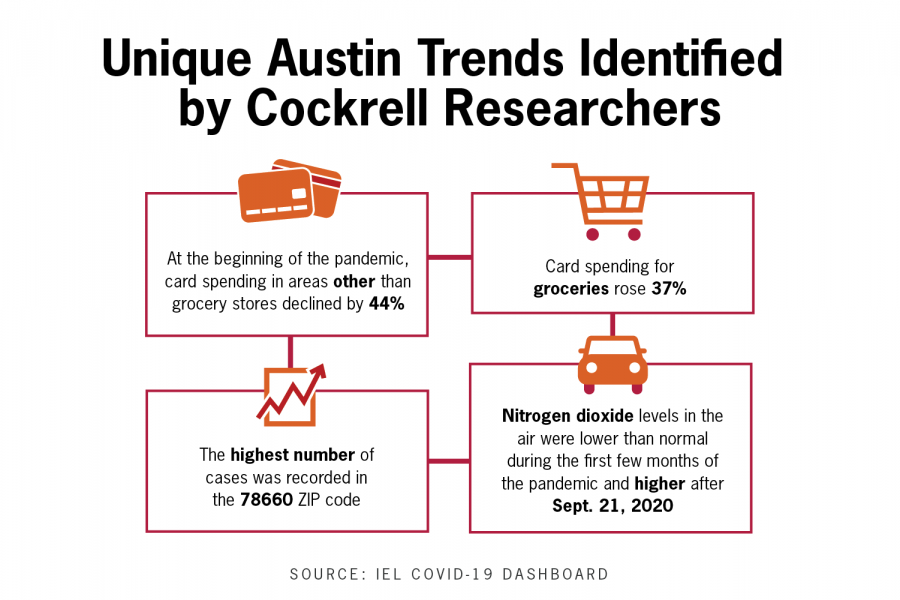
Researchers at the Cockrell School of Engineering created a new COVID-19 dashboard this month that shows how trends such as vaccine rates and flight passenger traffic have changed in the pandemic.
Zoltan Nagy, project lead and assistant professor in the Department of Civil, Architectural, and Environmental Engineering, said they created the dashboard to consolidate public information into an easy-to-use visual format that serves everyone in the Austin area. The dashboard features several graphs relating to areas such as public health, the economy, transportation and air quality.
The dashboard is kept up to date with in-depth, publicly available data, which includes COVID-19 case counts by ZIP code, changes to small business revenue, traffic volume and nitrogen dioxide concentration in the air. The data refreshes automatically when the information from its source updates, Nagy said.
“You see some things in the media showing (something) has gone down this much, has dropped this much,” Nagy said. “But then trying to figure out how it has changed over time, or also, how it is compared to other things in the same place, same city — that’s (what) we were interested in.”
The researchers consist of faculty and students, but Nagy said students were instrumental to the dashboard’s creation and had the idea to publish their graphs online.
Graduate student Kingsley Nweye, who organized and led data collection for the project, said they plan to add information trends to the dashboard, such as water and electricity usage.
“The more data sets you have, the better the picture of things that are in the city,” Nweye said. “So we’re just trying to paint as broad a picture as possible.”
Environmental engineering senior Calvin Lin, who designed the dashboard, said one of the most important things the dashboard accomplishes is creating a space where anyone can see the data and the sources together.
“It also brings in and pulls data from a much broader number of sources and lets people get a better overview of it all,” Lin said. “And if they’re interested, they can click on the source and then go to the data itself if they want to explore more detail.”
Nagy said while there is a wealth of recent data on the dashboard, the major takeaway is that different aspects of life are beginning to return to life before COVID-19.
“You start to see hope at the very end,” Nagy said.