Redesign the “Make It Your Texas” campaign
November 18, 2022
It’s another beautiful day on the Forty Acres, and you’re walking across South Mall. Looking at the intricately designed buildings and statues, you wonder how many hours were spent designing every detailed inch of campus.
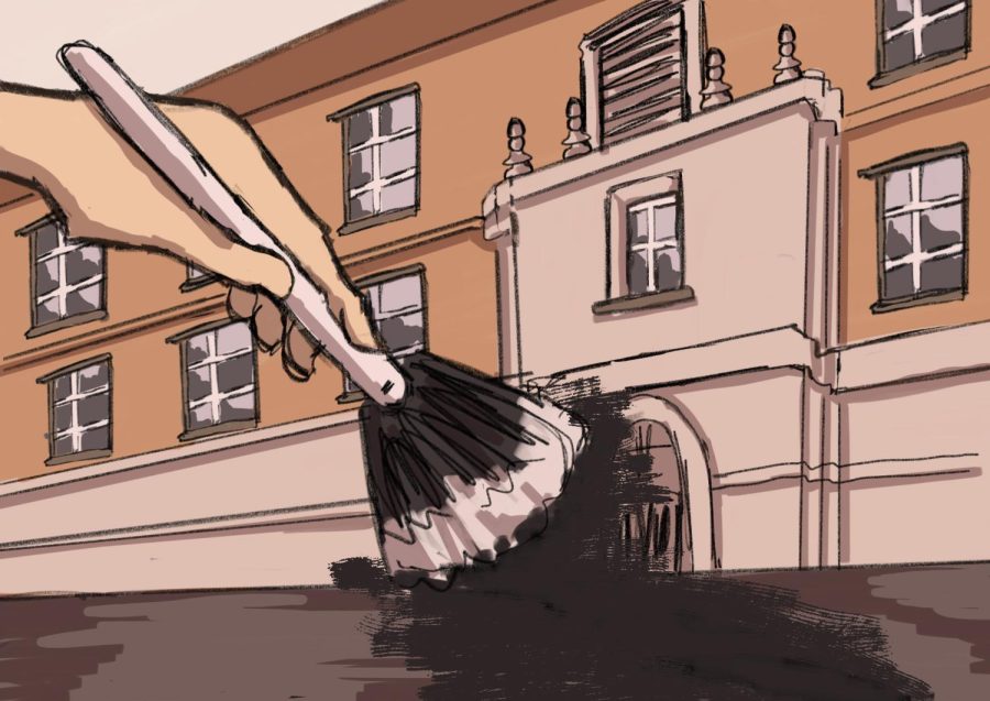
These thoughts subside in seconds when you see the massive, ugly gray mural that has been slapped across the steps of the main building. The “Make It Your Texas, Make It Our Texas” murals covering the steps of the Main Building and Gregory Gym do a disservice to the beautiful architecture behind them.
Douglas Koehne, 1991 UT alumnus, vice president of Corgan Architecture and Student Services Building architect, described UT’s plan for design cohesion created in the ‘90s.
“It was always meant to have a lot of different styles around the campus, but there has to be a level of things working together,” Koehne said. “Just like any other university, it’s not just the buildings that are important, but it’s the spaces between the buildings.”
Unfortunately, UT’s unsystematic mural addition undid decades of meticulous campus designing in one go.
However, this is not the effect the University hoped to have with this rebranding. According to UT News, “Make it Your Texas” represents individual empowerment that serves a greater community.
“The inspiration of this campaign is two fold: first, to bring burnt orange spirit and pride to our physical space, something we’ve been wanting to do for a long time,” said Emily Reagan, UT vice president and chief marketing and communications officer, in an email. “And second, to encourage our students, staff and faculty to embrace the many ways to shape their personal experience at UT.”
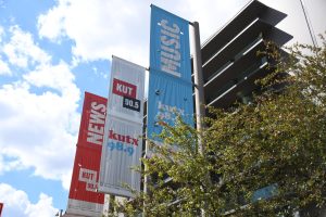
While the campaign has featured other physical signage, arguably the most significant addition has been the staircase murals in front of Gregory Gym and the Main Building.
The murals’ gray backdrops add a dull note to this otherwise colorful atmosphere. This University rebranding begs the question of whether the campaign is doing a disservice to beautiful, long-standing architecture.
Koehne cautioned against haphazard tweaks on campus.
“Everything has to be made with kind of that greater picture of, how does it fit into the overall building and area around the building as a whole,” Koehne said. “So when you start changing some of those things after the fact, you have to be really careful that you’re not starting to eat away at the bigger picture of what that space or what that building is trying to do.”
Undeclared sophomore Ricardo Trinh has not personally noticed the murals, but said student discomfort with modifications around campus is understandable.
“People don’t tend to like changes too much,” Trinh said.
Change in a school as old as this one is inevitable — the UT campus should live, breathe and develop alongside its residing students. However, it’s the administration’s responsibility to ensure that these changes are working alongside UT’s architecture, color palette and culture, rather than against it.
In the future, the “Make It Your Texas” campaign will appear in more college buildings and student spaces. Before moving the campaign deeper into campus, the University should revise it so as to not compromise aesthetic integrity. Opting for a more colorful, creative mural would better celebrate UT’s diversity and add a unique visual element to campus.
Art could be a productive way to promote individuality at UT. However, its current application — gray murals on staircases — compromises both the campaign’s message and the timeless architecture behind it.
Hosseini is an international relations freshman from Sugar Land, Texas.