A picture may be worth a thousand words, but scientists today don’t place the same emphasis on figures and colors that they do on text.
Chad Greene, a graduate research assistant at the UT Institute for Geophysics, is trying to solve this problem.
“There’s a common perception that while language is important in science, color is purely an artistic choice that cannot be disputed,” Greene said. “We’re saying that when colors are used to convey numerical information, the colors take on the same scientific responsibility as language.”
Greene said he hopes to fix this serious problem in science communication. He recently partnered with researchers from Texas A&M University to publish a paper titled “True Colors of Oceanography: Guidelines for Effective and Accurate Colormap Selection.”
The paper, published in the September issue of the journal Oceanography, describes a set of guidelines to consider when selecting or creating color maps or oceanographic data display.
“With this paper, we want to spur scientists to think about the impact of the color maps they use to present their data,” said Kristen Thyng, lead author of the paper and assistant research professor at Texas A&M University. “Generally, we have found that while there is a lot of evidence that color map choice is very important for how well an audience understands the figure, it still doesn’t necessarily receive a lot of particular attention.”
While there is a set convention for the formatting of the graphs themselves, guidelines for color choice have not been widely adopted in the scientific community.
“That means every time a scientist looks at a color graphic they have to figure out how to interpret it, and when perceptually wacky color schemes are used, interpretation accuracy suffers,” Greene said.
Currently, the common rainbow color map is the default setting in many scientific data plotting programs. Thyng said she and her team have noticed inherent flaws in the rainbow gradient.
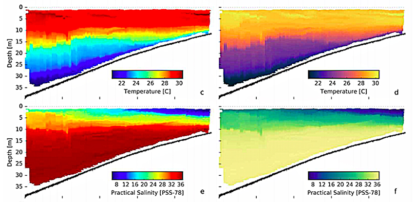
“While hue-based [rainbow] color maps are commonly used, they can lead to misinterpretation,” Thyng said. “For example, we see yellow in a typical rainbow as being brighter than the surrounding colors, so an audience will tend to notice whatever is represented in yellow more strongly compared to the rest of the plot, regardless of whether it was intended to be more important or not.”
Greene said that as an alternative, color palettes should be perceived linearly, just as our number system is on a linear scale.
“As a rule of thumb, if the underlying data ranges from low values to high values, the corresponding colors should go from dark to light or light to dark,” Greene said. “Humans are pretty good at interpreting lightness gradients. If your data is associated with specific colors in nature, try to use those colors when representing your data.”
In conjunction with these guidelines, the team has designed a collection of perceptually uniform color maps called “cmocean” that seek to alleviate the current problems regarding color usage in oceanography.
These new color maps attempt to match a palette of colors to the variable they represent. Greene said that the team designed their color maps to appeal to intuition for common oceanographic datasets like temperature, salinity or sea ice concentration.
“For example, we developed a palette of cool to warm colors to represent temperature,” Greene said. “We use shades of green to represent chlorophyll concentration. And for sea ice concentration, we use deep ocean blue to represent areas of open water, then the palette gradually transitions to pure white, corresponding to complete sea ice cover.”
The collection is available online to anyone who wants to use them.
Thyng said the team hopes to start a conversation about color maps within the scientific community and provide strong color map options for other researchers to use.
“I think these guidelines are best used [when] interpreted by researchers for their own work,” Thyng said. “There are many considerations that go into an individual plot that the researcher needs to make on their own. We hope they will consider the guidelines in our paper as they make these decisions.”
Greene said overall, the scientific community’s reaction to the team’s proposed set of guidelines has been positive.
“We’ve attracted social media attention from some big-name climatologists who care about this stuff,” Greene said. “Hopefully our work will raise color awareness among the scientists who aren’t already self-identified data graphics nerds like us.”


