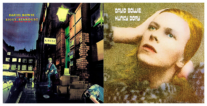
On a cold January evening, David Bowie stood on London’s Heddon Street, posing for the cover of his iconic fifth album, The Rise and Fall of Ziggy Stardust and the Spiders from Mars.
Shortly after, a friend tapped English artist Terry Pastor to design the cover. From his studio, Pastor airbrushed and colored the photo, giving the cover its illustrated style.
Pastor’s artwork has graced album covers for Bowie and the Beach Boys and been featured in Roman Polanski and Roman Ford Coppola’s private collections. Last week, local gallery Modern Rocks began an exhibition of Pastor’s limited-edition David Bowie prints. His other covers and artwork and can be found at his website.
The Daily Texan spoke with Pastor about the album cover and the evolution of album art.
Daily Texan: Looking back, these became two of his most iconic albums. Did you have any inclination when you were designing the covers how famous they would become?
Terry Pastor: At the time, Bowie wasn’t very well known at all. It was only after Ziggy that he became famous. [When I was designing the cover] I didn’t think it was anything particular. Now in retrospect, because both of the LPs were very strong musically, the cover has now been linked to the album forever now.
DT: Having known Bowie before he skyrocketed to fame, did you see how things changed for him afterward?
TP: He would occasionally drop into my studio in Covent Garden, London, and we would have a drink in the pub next door. He would go completely unnoticed, but a few months after the release of Ziggy Stardust he became a mega-star and couldn’t go out in public without being mobbed.
DT: What was the process of designing these covers for you?
TP: I think it was unusual that these were photographs. The image was already there, so in the case of both of these covers, I didn’t really have any art direction at all. Other than being asked to cover [the photos] up, there wasn’t really any input. Generally, I prefer to use the band’s music or the title of the LP to give me an idea.
DT: What was Bowie’s reaction to the covers?
TP: I just remember when I was doing the front and back covers for Ziggy, I got a phone call, and it was [Bowie] asking how it was going. When I told him I was about to start working on the back, he was surprised. I guess he didn’t really have much say in the whole thing.
DT: What kind of artistic decisions did you make when designing Ziggy Stardust?
TP: David’s jumpsuit was a pale grey/green color, but I wanted him to stand out from the background more, so decided to color it turquoise. Also [I] colored his hair blond to make him stand out more. The title lettering for Ziggy Stardust was airbrushed artwork that was created by rubbing down a Letraset type and tracing it off onto art board and painting it with the airbrush. [It was] a very hands on way of doing things. Now it would all be done by computer.
DT: Having created several covers throughout your career, do you think album art has changed as people transitioned from vinyl to downloads?
TP: Going from a 12-inch vinyl cover, particularly if it was a gatefold, to a CD, which was half the size, and now to downloads hardly getting any covers at all, it’s a shame. I think the whole thing with a record is that you can study [the cover] while you listened to it.